

Veo en Boing Boing un enlace a un artículo de Wired titulado The Beauty and Total Illegibility of Extreme Metal Logos. Aunque el texto es fundamentalmente una promoción del libro «Logos from Hell» de Mark Riddick, he reconocido el nombre de Christophe Szpajdel, el hombre de los logotipos araña y me he fijado en lo que tenía que decir al respecto:
[…] just like any other form of design, a good metal logo relies on basic principles like symmetry, visual harmony, letter height, and precision. When making a band logo, Szpajdel often works at an architect’s table, where he draws in pencil before tracing in pen. […] Asked what makes a good black metal logo, he said, “I think the lettering should be sharp, inspired by gothic/old English fonts. First and last letters should be bigger than the middle ones. Unlike most people who think a black metal logo should contain symbols like pentagrams, inverted crosses… I think this is overdone.”
Claro que siempre están los que van por libre, como el grupo escocés de death metal Party Cannon y su logotipo:
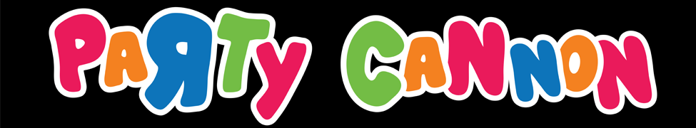
Como decía Robert Pasbani en Metal Injection, en un género donde todo gira entorno a llevarlo todo al extremo (blast beats extermos, vocalizaciones extremas, logotipos extremadamente ilegibles), ¿qué hay más extremo que hacer lo diametralmente opuesto a la norma?